 |
Summary:- Used for:
- Presenting queries, warnings, or information.
- Asking user to make a selection.
- Dialogs appear on top of application content area, centred on screen.
|
Java
Related design guidelines
|
Alerts and pop-up lists open in the foreground, and are always vertically and horizontally centred. The background, including the header bar and status bar, is dimmed black (60%), to give emphasis to the pop-up itself while still allowing the context to be seen.
The pop-up component sizes are the same in both portrait and landscape orientations.
Alerts are typically dismissed by pressing a dedicated button. For example:
- 'OK', when the alert is purely informative.
- 'Cancel', when there is an ongoing operation.
| Alerts |
|
|---|
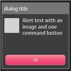
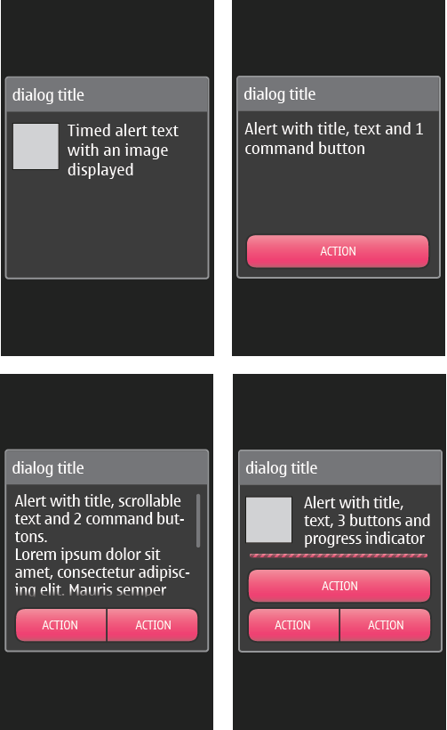
Figure 1. Timed alert, alerts with 1 - 3 buttons and with optional icons
|
- Contains 0 - 3 buttons.
- If 0 buttons are used:
- Timed alert.
- Pressing outside the alert dismisses the alert.
- If 1 button is used (user response note):
- Use case is to ensure that user has had time to read the text, because
- text is long,
- and/or the note appears after a delay during which user's attention to screen is likely to be lost.
- Stays on screen until user taps the button.
- If 2 buttons are used (confirmation query):
- Buttons are placed on the same line.
- Left button has the positive command.
- Right button has the negative command.
- If 3 buttons are used (confirmation query):
- Two buttons are placed on the same line (LSK, RSK), and the third above these (MSK).
- The bottom-right button must be Back/Cancel.
- Buttons can be used for short commands only (e.g. Yes, No, OK, Cancel, Back etc.)
- Buttons can't be used for values (e.g. selecting connection mode from "USB", "Cable, and "Bluetooth").
- For values, use pop-up list described below.
- Title is recommended; if title is not defined, the title zone is shown but is empty.
- In case the text is dynamic, split it up into title and body, e.g.:
- “delete contact? (title)
- Anna Adams” (body)
- Body text can be scrolled.
- Determinate or indeterminate progress indicator (gauge) is optional.
- Use "Cancel" to stop the process and discard all changes made by the process.
- Use "Quit" to stop the process but to keep all the changes made by the process.
- Icon is optional.
|
| Pop-up list with title (dialog) |
|
|---|
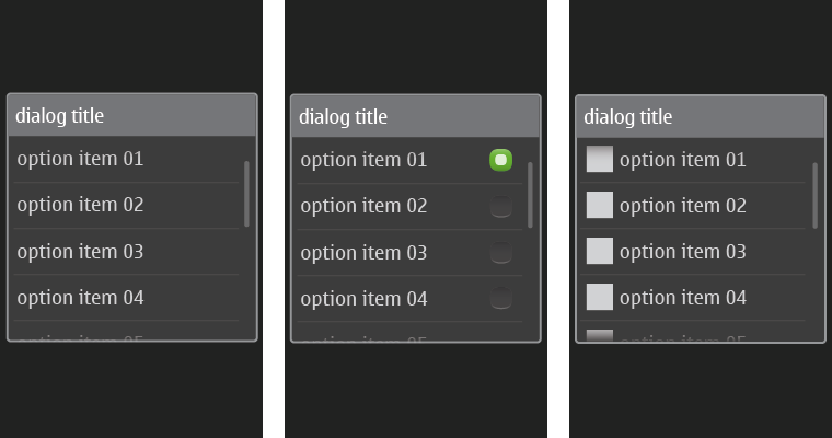
Figure 2. Pop-up list without icons, with radio buttons, and with icons
|
- Only available in Forms and on Canvas.
- Pop-up list with a title.
- If no title is defined, the list will be rendered as a long press options list (see below).
- Items can be:
- Text only.
- Icon and text.
- Text and selection indicator.
- Icon, text, and selection indicator.
- List content becomes scrollable when the content doesn't fit the pop-up size.
- Only exclusive choices allowed
- List closes after selection, or by tapping outside the list.
- No button.
|
| Pop-up list without title |
|
|---|
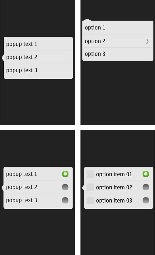
Figure 3. Pop-up list with text, with a nested list, with text and selection indicators, and with icon, text, and selection indicators
|
- Only available in Forms and on Canvas.
- Pop-up list without a title.
- Look like an Options list or like a Context menu.
- Items can be:
- Text only.
- Icon and text.
- Icon, text, and selection indicator.
- Text and selection indicator.
- List content becomes scrollable when the content doesn't fit the pop-up size.
- Nested lists are supported.
- List closes after selection, or by tapping outside the list.
- No button.
- Application can determine where the "tail" of the pop-up appears, and therefore use this to be a contextual menu.
|
